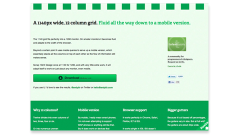
A 1140px wide, 12 column grid. Fluid all the way down to a mobile version.

„The 1140 grid fits perfectly into a 1280 monitor. On smaller monitors it becomes fluid and adapts to the width of the browser.
Beyond a certain point it uses media queries to serve up a mobile version, which essentially stacks all the columns on top of each other so the flow of information still makes sense.
Scrap 1024! Design once at 1140 for 1280, and with very little extra work, it will adapt itself to work on just about any monitor, even mobile.“

Ausprobieren! Das Photoshop Template dazu gibt es hier.

( via swissmiss )
Eine Antwort zu „A 1140px wide, 12 column grid. Fluid all the way down to a mobile version.“

  1. Ewald / Der Vorschlag klappt bei mir nicht. Wenn ich neues DWORD erstellen will, kommt die Fehlermeldung, dass in die Registrierung nicht geschreiben werden darf. Wahrscheinlich muss ich regedit als Administrator ausführen, weiß aber nicht wie. Außerdem habe ich die x64 Version und müsste also einen QWORD erstellen, oder?

Schreibe einen Kommentar

Deine E-Mail-Adresse wird nicht veröffentlicht. Erforderliche Felder sind mit * markiert

GDPR Cookie Consent mit Real Cookie Banner