A question which comes up a lot: What should we pay for research incentives these days? This calculator might help to get an idea: https://ethn.io/incentives/calculator
Made a new research incentive calculator based on the conceptual framework of Run-DMC and data from 40,000+ @ethnio participants across 140 countries.👨🏻🔬🤖https://t.co/fhboFyQ7Hy
„Have you ever lost your voice? How did you handle that? Perhaps you carried a notebook and pen to scribble notes. Or jotted quick texts on your phone. Have you ever traveled somewhere that you didn’t speak or understand the language everyone around you was speaking?“
Perfect for your field research, interviews, observations and shadowing:
Once more for the weekend crew: top tips for iPhone filming, on a wallet-sized card. Made for BBC staff, but you can save this too. #mojopic.twitter.com/9DIkS6ndBj
Loom is a chrome extension that captures screen, video and audio. Perfect for lofi usability evaluations. It even has an InVision integration. I will definitely test this out more often.
„VisualSitemaps automatically generates beautiful visual sitemaps + high-resolution screenshots of any site or app, making it fast and easy to perform in-depth site audits for UI, UX, SEO, and marketing research.“
„AutoDraw is a new kind of drawing tool that pairs the magic of machine learning with drawings from talented artists to help everyone create anything visual, fast.“
What a great, funny tool! I really like Protobot because it triggers me to think about services and improvements and especially the unknown unknowns! The tool generates random product and service ideas.
„Some are brilliant. Some are bizarre. Some are controversial. Some are hilarious. Some are very, very wrong“
This visual vocabulary titled „chart doctor“ is a very useful and great starting point for making informative and meaningful data visualizations. It is used by the Financial Times team to decide which visualization to use.
via @simongerman600
This is just great! Daniel Kunin, a student of Brown university has created a visual introduction to statistics! As we learned in our university stats course understanding (basic) statistics and especially the term „statistical significance“ is becoming more and more important (yes, even when you’re a designer!)
„The goal of the project is to make statistics more accessible to a wider range of students through interactive visualizations.“
Oh would I only have known this last year when I was fighting with probability theory, combinatorics, ANOVA, confidence intervals, cohen’s d & co in the stats course.
Ah the internet awesomeness. Someone made a chrome plugin for heuristic evaluations. Personally I find this chrome plugin super useful, because it saves me lots of time making screenshots, pasting them in a doc, formatting.. Check it out. It’s perfect for both: a quick more „lofi-ish“ design evaluation to communicate some visual design issues and and a more advanced heuristic evaluation – it even supports you with that because it comes directly with Nielsens 10 Usability Heuristics for User Interface Design. Plus: You can also define your own (client specific) heuristics.
„UX Check makes heuristic evaluations quick and easy. The extension will open up Nielsen’s Ten Heuristics in a side pane next to your website. When you click on an element that doesn’t comply with a heuristic, you can add notes, and a screenshot will be saved. At the end, you can export everything to a docx so that you can share them with your team“
‚We’re not designing pages, we’re designing systems of components‘—Stephen Hay.
Obwohl ich noch nicht so ganz durchsteige, wie genau das Setup läuft, halte ich das Projekt Patternlab.io – Demo hier – für sehr beobachtenswert.
Atomic Design heisst der Ansatz, bei dem es darum geht, eine (entwicklungsfreundliche!) Komponenten Library für Webprojekte zu erstellen und kontinuierlich zu pflegen statt endlose Seiten auszugestalten. Elemente werden unterteilt in Atome, Moleküle, Organismen, Templates und Pages. „
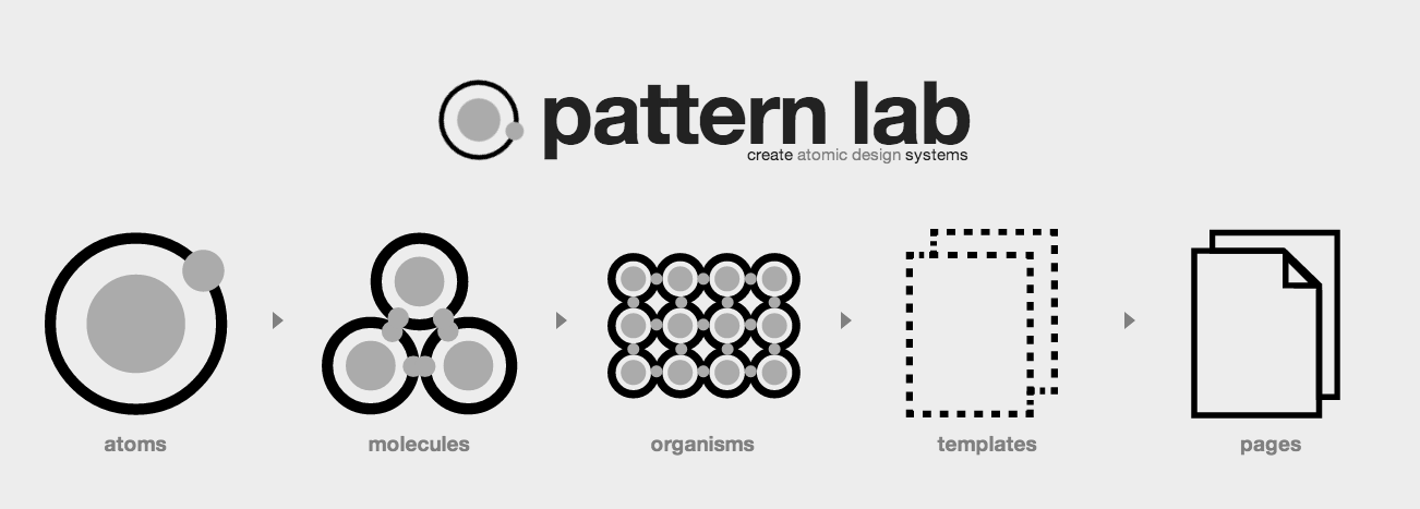
Webdesign Tools: Pattern Lab“ weiterlesen
Similar to Realizer App here’s another one. Just upload your sketches, hifi wireframes or fancy designed jpg Files and link the images. The FiledTest app is currently in private beta.
„For Developers and UX designers prototyping and testing interaction concepts.“
This is how it works:
1. Build your app mockups or sketches.
2. Upload your screen mockups or sketches
3. Link your screens.
4. Download and run the Realizer app.
If you want to build an easy to use and appealing piece of software, writing Scenarios for your Usergroups is not a new thing and has been around for a while – User Scenarios are a really great and powerful conceptual Design Tool.
Writing Scenarios does help us to think much more in a way like our Users do and to rethink and reflect the Design / IA we’re building.
Today I found a Mac Desktop Tool, originally made for Screenwriters/Writers called „Scrivener“ which seems perfect in helping us building these narrative User-Stories/Flows/ Scenarios with a simple non-linear approach, working with adjustable index cards on a corkboard, according to interaction design, which is definitely a non-linear design process.
There are different view modes available ( list, cards, etc..) and you can write the underlying story containing a little more depth of what should happen „behind“ each index card – you’ll find there also very customizable labeling options ( name them e.g. something like „required in v1“ or „nice to have“ or „later“ ) which will allow you to write down your conceptual ideas quickly and save them for a later Version of the Product – but already within the flow.
Features included : Creating Folders, Insert Images, Export etc.. There is an extra Folder for all the Research Stuff perfect for quick reference since you’re able to put all the related things in just one place, what I think is pretty cool.
List View of Index CardsComposite View with Subdocuments/ Stories behind
I think this is a really GREAT Tool to do structural and conceptual work before and during the Design Process, due it allows you to generate a much more human centered approach to the „Product Backlog“ of what is required instead of boring written spec lists without knowing the WHY of the „requirements“ and the Users Goals and Needs. Cost: $45, 30 Days Trial free
By the way, there is a similar interesting iPad app too, called „Index Card“ .
P.S. I hope my written English is not too bad, since this is my first Article in English – trying to switch this blog to English, due the Interaction/UX Design Community is an international one and we should share all the interesting things and not exclude people due languages :)
Wow! Bilder austauschen made easy. Ein Paradebeispiel für geniales UCD. Es geht einfach nur darum, Bilder auszutauschen, kein Drumherumgedöns, Nichts, nada. Punkt. :)
Funktioniert bis jetzt leider nur im Chrome, oder ab Firefox 4.
20 Things I learned about the Browser and the Web ist ein auf HTML5 basierendes interaktives Buch, in welchem die Grundlagen über das Internet und Browser mit Illustrationen untermalt erklärt werden. Herausgegeben wurde es vom Google Chrome Team.
Man kann es jederzeit schließen, denn die Entwickler haben ein Lesezeichen eingebaut, welches sich merkt, wo man gerade war.
SymbolAssist ist eine browserbasierte, kategorisierte Unicode Chars Map. Click, Copy, Paste.
Nettes Tool und – wie praktisch – auch als Bookmarklet verfügbar :)