Filling out forms is no fun. Decreasing the number of fields in a form is always a desirable goal in webdesign because it could have an impact on conversion.
When it comes to design those forms we as designers, developers or product owners should always question the necessity of every single input field which leads to the following question:
Do we really need password confirmation fields?
Did you ever wonder why you are asked twice for entering your password during a registration process? The reason why users have to confirm passwords is simple: to avoid that people submit a password with typo mistakes without recognizing these.
These typos are easily made because the password is masked during typing and afterwards. The password confirmation field is just a simple ‚do passwords match?‘ misspelling control function because the password appears hidden.
This leads us to the next question:
Why masking passwords?
However, the masking of password fields has only one purpose: visually representing a secure process and hide sensible information/data from other peoples curious eyes. It’s a well known pattern which makes sense especially for login forms.
A 2012 article on UX Movement explains very well the difference of the login and sign up process when it comes to password masking.
How to speed up registration and prevent errors – Design solutions:
So what about using only one single password field for the sign up/registration process to decrease the number of fields in your form (and therefore probably increase conversion)? Sounds cool? But there is one thing which has to be considered when using this pattern.
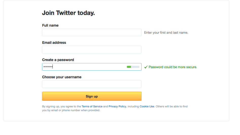
Twitter for example provides the one password field pattern for signing up – but on the other hand recommends a strong – and therefore probably more complicated – password which is error-prone because you can’t view what you are typing. This is pretty bad because chances are high to submit a password with typos and don’t even recognize it:
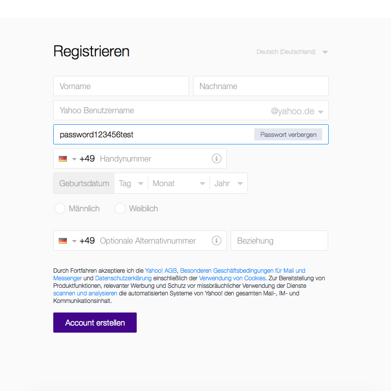
The solution is easy: give people the chance to view what they are typing – this can lead to error prevention and less frustration. With that opportunity, you can kill the „confirm password“ field.
There are different ways of doing it – the most popular pattern is to keep the password field masked by default but give people the opportunity to unmask it with a „show password“ functionality. This combines the „it’s secure feeling“ (masked password) with users control over the machine (make it visible) and so matches the usability heuristics.
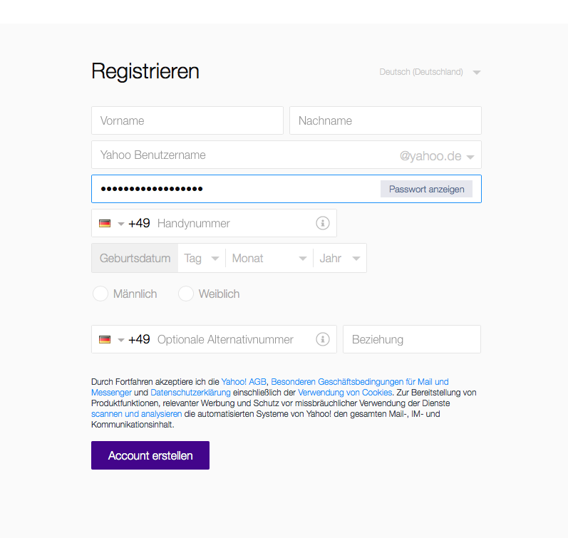
Yahoo for example does a pretty good job on its sign up page with this single field password pattern (not considering that the rest is crap ;) ):
Few services do it. So why not you? It will speed up and simplify the registration process for your service and people will be grateful for a shorter form they have to fill out. But make sure that people can check their passwords and take control of any misspelling.
Schreibe einen Kommentar